Plotting average DW-NOMINATE Liberal-Conservative scores in the US Congress
Updates and revise Voteview plots of party average DW-NOMINATE scores of overtime.
By Spencer Graves in By Others
October 21, 2024
This is from a vignette in the Ecfun package. Reproduced here with no modifications.
#Use pacman to load and install dependencies.
library(pacman)

# Install `tidyverse`, ... if needed and then call `library` ...
p_load(tidyverse, ggplot2, ggrepel)
As of 2024-10-02, the readDW_NOMINATE function is available in the GitHub version of the Ecfun package but not in the CRAN version. Make sure we have that version of the package.
notInstalled <- (system.file(package='Ecfun') == '')
if(notInstalled ||
   all(unclass(packageVersion('Ecfun'))[[1]]<=c(0, 3, 3))){
      devtools::install_github('sbgraves237/Ecfun')
}
Create the polarization data and desired graphics similar to some documented on a web page created by Keith T. Poole, the Philip H. Alston Jr. Distinguished Professor in the Department of Political Science at the University of Georgia.
This R Markdown vignette was inspired by a vignette by UCLA political science professor Jeff Lewis; his vignette is available on GitHub
This uses a polarization data set originally created by Keith T. Poole and Howard Rosenthal in 1989-1992 while at Carnegie Mellon University. It is maintained by Jeff Lewis. This data set included the following fields:
  0.  Chamber
  1.  Congress Number
  2.  First Year of the Congress
  3.  Difference in Party Means - first dimension
  4.  Proportion Moderates
  5.  Proportion of moderate Democrats (-0.25 to +0.25)
  6.  Proportion of moderate Republicans (-0.25 to +0.25)
  7.  Overlap
  8.  Chamber Mean - first dimension
  9.  Chamber Mean - second dimension
 10.  Democratic Party Mean - first dimension
 11.  Democratic Party Mean - second dimension
 12.  Republican Party Mean - first dimension
 13.  Republican Party Mean - second dimension
 14.  Northern Republican Mean - first dimension
 15.  Northern Republican Mean - second dimension
 16.  Southern Republican Mean - first dimension
 17.  Southern Republican Mean - second dimension
 18.  Northern Democrat Mean - first dimension
 19.  Northern Democrat Mean - second dimension
 20.  Southern Democrat Mean - first dimension
 21.  Southern Democrat Mean - second dimension
We begin by loading the data current nominate data from Voteview.com:
#nom_dat <- #read_csv("https://voteview.com/static/data/out/members/HSall_members.csv")

nom_dat <- Ecfun::readDW_NOMINATE()
To calculate the mean location of the Northern and Southern Democratic and Republican delegations, this follows Congressional Quarterly in defining the “Southern states” as the 11 states of the Confederacy plus Oklahoma and Kentucky. Democrats and Republicans are those using ICPSR party codes 100 and 200 respectively.
The following code transforms the member-year NOMINATE data into the chamber-year data on polarization:
south <- c(40:49,51,53)
polar_dat <- nom_dat %>%
    filter(congress>45 &
           chamber != "President") %>%
    mutate(
      year = 2*(congress-1) + 1789,
    ) %>%
    group_by(chamber,congress,year) %>%
    summarize(
      party.mean.diff.d1 = mean(nominate_dim1[party_code==200],na.rm=T) -
                           mean(nominate_dim1[party_code==100],na.rm=T),
      prop.moderate.d1 = mean(abs(nominate_dim1)<0.25,na.rm=T),
      prop.moderate.dem.d1 = mean(abs(nominate_dim1[party_code==100])<0.25,na.rm=T),
      prop.moderate.rep.d1 = mean(abs(nominate_dim1[party_code==200])<0.25,na.rm=T),
      overlap = (sum(nominate_dim1[party_code==200] <
                       max(nominate_dim1[party_code==100],na.rm=T),na.rm=T)  +
                 sum(nominate_dim1[party_code==100] >
                       min(nominate_dim1[party_code==200],na.rm=T),na.rm=T))/
                 (sum(!is.na(nominate_dim1[party_code==100]))+
                  sum(!is.na(nominate_dim1[party_code==200]))),
      chamber.mean.d1 = mean(nominate_dim1,na.rm=T),
      chamber.mean.d2 = mean(nominate_dim2,na.rm=T),
      dem.mean.d1 = mean(nominate_dim1[party_code==100],na.rm=T),
      dem.mean.d2 = mean(nominate_dim2[party_code==100],na.rm=T),
      rep.mean.d1 = mean(nominate_dim1[party_code==200],na.rm=T),
      rep.mean.d2 = mean(nominate_dim2[party_code==200],na.rm=T),
      north.rep.mean.d1 = mean(nominate_dim1[
        party_code==200 & !(state_icpsr %in% south)],na.rm=T),
      north.rep.mean.d2 = mean(nominate_dim2[
        party_code==200 & !(state_icpsr %in% south)],na.rm=T),
      south.rep.mean.d1 = mean(nominate_dim1[
        party_code==200 & (state_icpsr %in% south)],na.rm=T),
      south.rep.mean.d2 = mean(nominate_dim2[
        party_code==200 & (state_icpsr %in% south)],na.rm=T),
      north.dem.mean.d1 = mean(nominate_dim1[
        party_code==100 & !(state_icpsr %in% south)],na.rm=T),
      north.dem.mean.d2 = mean(nominate_dim2[
        party_code==100 & !(state_icpsr %in% south)],na.rm=T),
      south.dem.mean.d1 = mean(nominate_dim1[
        party_code==100 & (state_icpsr %in% south)],na.rm=T),
      south.dem.mean.d2 = mean(nominate_dim2[
        party_code==100 & (state_icpsr %in% south)],na.rm=T),
    )
## `summarise()` has grouped output by 'chamber', 'congress'. You can override
## using the `.groups` argument.
Print the first 3 lines of the resulting dataset and create a local copy in *.csv format:
head(polar_dat, 3)
## # A tibble: 3 × 22
## # Groups:   chamber, congress [3]
##   chamber congress  year party.mean.diff.d1 prop.moderate.d1
##   <chr>      <dbl> <dbl>              <dbl>            <dbl>
## 1 House         46  1879              0.786            0.130
## 2 House         47  1881              0.783            0.100
## 3 House         48  1883              0.724            0.216
## # ℹ 17 more variables: prop.moderate.dem.d1 <dbl>, prop.moderate.rep.d1 <dbl>,
## #   overlap <dbl>, chamber.mean.d1 <dbl>, chamber.mean.d2 <dbl>,
## #   dem.mean.d1 <dbl>, dem.mean.d2 <dbl>, rep.mean.d1 <dbl>, rep.mean.d2 <dbl>,
## #   north.rep.mean.d1 <dbl>, north.rep.mean.d2 <dbl>, south.rep.mean.d1 <dbl>,
## #   south.rep.mean.d2 <dbl>, north.dem.mean.d1 <dbl>, north.dem.mean.d2 <dbl>,
## #   south.dem.mean.d1 <dbl>, south.dem.mean.d2 <dbl>
write_csv(polar_dat,file="voteview_polarization_data.csv")
This dataset is now available as a csv file
here.
Party means on the liberal-conservative dimension over time by chamber
Convert to a long format used by
ggplot2:
polar_dat_long <- polar_dat %>% gather(score,value,-chamber,-year,-congress)
labels <- c("dem.mean.d1"="DEM",
            "rep.mean.d1"="REP",
            "north.dem.mean.d1"="N.DEM",
            "south.dem.mean.d1"="S.DEM")
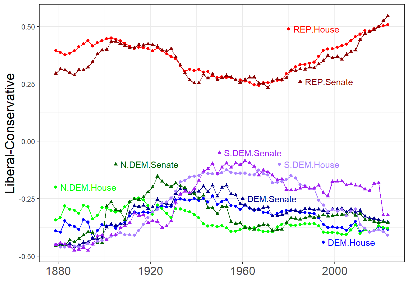
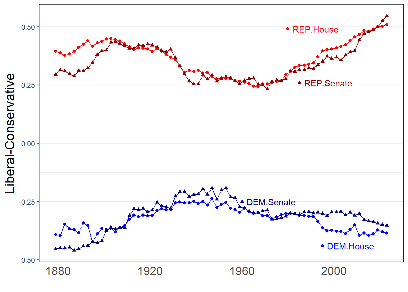
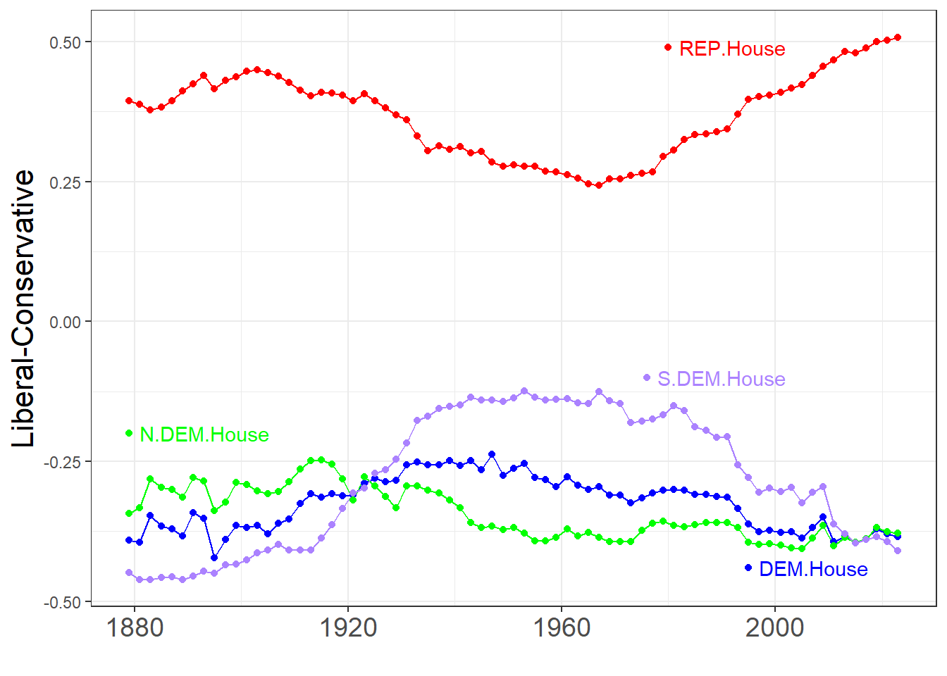
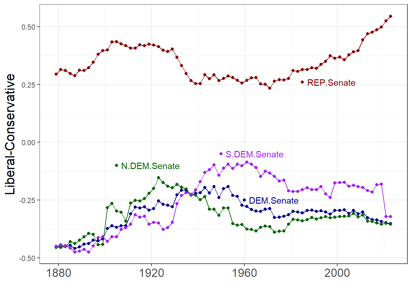
Jeff Lewis’ code created separate plots for the US House and Senate. The following allows plotting data for the House and Senate on the same plot.
PolarColor <- data.frame(
  chamber=rep(c("House", "Senate"), 4),
  party=rep(c('REP', 'DEM', 'S.DEM', 'N.DEM'),
            e=2),
  party.chamber=c('REP.House', 'REP.Senate',
      'DEM.House', 'DEM.Senate', 'S.DEM.House',
      'S.DEM.Senate', 'N.DEM.House', 'N.DEM.Senate'),
  year =c(1980, 1985, 1995, 1960,
          1976, 1950, 1879, 1905),
  value=c(.49, .26, -.44, -.25,
          -.1, -.05, -.2, -.1),
  Color=c('red', 'darkred', 'blue', 'darkblue',
      'mediumpurple1', 'purple', 'green', 'darkgreen'))
rownames(PolarColor) <- PolarColor$party.chamber
You can change the colors and where the lines are lines are labeled by, e.g., creating a different
data.frame with these same columns with different values for Color, year and value and use it as argument PolarColors in the following function, polarizationPlot:
polarizedPlot <- function(chamb=c('House', 'Senate'),
    parties=c('REP', 'DEM', 'S.DEM', 'N.DEM'),
    PolarColors=PolarColor,
    x_breaks=seq(1880, max(pdatl$year), by=40),
    partySymbOffset=c(REP=-12, DEM=-13, S.DEM=-17, N.DEM=-17),
    symbolShape=c(House=1, Senate=2)) {

  scores <- c(DEM="dem.mean.d1",REP="rep.mean.d1",
        N.DEM="north.dem.mean.d1",S.DEM="south.dem.mean.d1")[
          parties]
  pdatl <- polar_dat_long %>%
          filter(chamber %in% chamb,
              score %in% scores) %>%
          mutate(party=labels[score]) %>%
          ungroup()
  pc <- with(pdatl, paste(party, chamber, sep='.'))
  pdatl$party.chamber <- pc

  partyCh <- as.character(outer(parties, chamb, paste, sep='.'))
  polarCol <- PolarColors[partyCh, , drop=FALSE]
#  yearPch <- with(polarCol, year + partySymbOffset[party])

  Col <- polarCol[pc, 'Color']
  pdatl$Color <- Col

  g1 <- ggplot(data = pdatl,
       aes(x = year, y = value, group =
             party.chamber, color = Color)) +
    geom_line() +
    geom_point(aes(shape = factor(chamber)))

  g2 <- g1 + scale_color_identity() +
      theme_bw() + theme(legend.position = "none")

  g3 <- g2 + geom_point(polarCol, mapping = aes(
      x = year, y = value, color=Color,
      group=party.chamber, shape = factor(chamber)))

  g4 <- g3 + geom_text(polarCol, mapping=aes(
        x=year, y=value, color=Color,
        group=party.chamber, label=party.chamber),
      hjust = 0, nudge_x = 2)
  g5 <- g4  + xlab('') + ylab("Liberal-Conservative")

  g5 + theme(axis.text.x = element_text(size = 14),
      axis.title.y = element_text(size = 16))
}

(Pol6 <- polarizedPlot())

(PolRepDem <- polarizedPlot(parties = c('REP', 'DEM')))

(PolHouse <- polarizedPlot(chamb='House'))

(PolSenate <- polarizedPlot(chamb='Senate'))

Save plots.
library(svglite)
ggsave("voteview_HouseSenateParties.svg", plot=Pol6)
## Saving 7 x 5 in image
ggsave("voteview_House_party_means.svg", plot=PolHouse)
## Saving 7 x 5 in image
ggsave("voteview_Senate_party_means.svg", plot=PolSenate)
## Saving 7 x 5 in image
ggsave("voteview_HouseSenate_party_means.svg", plot=PolRepDem)
## Saving 7 x 5 in image
ggsave("featured_hex.png", plot=PolRepDem)
## Saving 7 x 5 in image
These graphics are now availabe in svg format as
voteview_HouseSenateParties.svg,
voteview_House_party_means.svg,
voteview_senate_party_means.png, and
voteview_HouseSenate_party_means.svg.
- Posted on:
- October 21, 2024
- Length:
- 5 minute read, 1045 words
- Categories:
- By Others
- Tags:
- hugo-site
- See Also:
- Ship Till X
- My Resume